The Greatness of Girls
2020 WEBBY WINNER: DIVERSITY AND INCLUSION
MY ROLES:
Creative/Art Direction (Illustration, Animation, Photoshoot)
Branding
Graphic Design
Producer
Shoot Styling
Retouching
TOTAL STAFF: 4 people
PROJECT LENGTH: 1 day shoot 5 days retouching/designing/motion
The Greatness of Girls was a campaign of a month’s worth of content that was meant to showcase the incredible awe-inspiring potential that girls have, especially when we believe in them and set them up for success. It was a celebration of this idea. Since we were focusing on National Girl’s Day, we had to create a lot of visually and editorially cohesive content quickly to be rolled out throughout the month of October that strongly illustrated this message.
I decided for the visuals that it was important to be bright and convey a fierce style of effervescent and unrelenting joy in the face of anything and anyone. I was very inspired by The Fearless Girl on Wall Street in this regard— to me she absolutely emanates the feeling of unrelenting and resilient joy and strength, redefining the symbolism of a small bodied girl. I also wanted to convey the fantastic nature of simply believing in something and how that nourishment causes more nourishment and growth (ie- let’s believe in our girls as a society! Let’s create avenues for success for them.) We leaned in hard on the idea of effervescence, fantasy, potential, and fierce joy; this was celebrating children so we had to have some fun with it, too! That led me to the idea of using Seuss-like flower imagery for growth, potential, and childlike fantasy and belief, of using bubbly pastel graphics for joy and fantasy, the lighting in the photography being bright and the shadows hard to convey fierceness, of showcasing an ordinary little girl as important as the great women she is surrounded by to encompass overflowing potential. As I mentioned, I took inspiration from The Fearless Girl on Wall Street (she’s been relocated, but her footprints remain) and several prominent feminist symbols as well as some frankly incredible historical women.
The Greatness of Girls was a full campaign; that is to say, it required distinct styles for illustration, it’s own logo, motion graphics, set design, graphics, social graphics, and photography. There would be a Video, editorial features and articles and a social campaign that all needed styling. I created the branding and visual language for the campaign and was overseeing and in many cases creating these things because of the tight timeline (2 weeks). As such, I had to do a lot of heavy lifting: I directed a team of illustrators in Thailand for the illustrations; I directed and produced a photoshoot for the Editorial articles and social campaign (and constructed the props!); I designed the video and digital graphics and directed the motion graphics designer on the style of animation; I created a photo-processing style and put it together with the graphics to create the final photography assets; I styled and propped the video shoot itself. That having been said, I worked with incredible and motivated creatives who all contributed to the quick and successful turnaround on this project with grace and professionalism. We gave it our all because we believed in the vision of the campaign; there’s no way we’d have accomplished all of this in two week otherwise. I was very proud of how it turned out and still feel lucky I oversaw and worked with such a brilliant team.
Copyright WildSky Media 2019; Photographer: Janine Ngai; Illustrator: Augi; Motion Graphics: Bam

Photography + Branding Section
Below you’ll see both the LOGO and color-story/branding I created (above you can see it animated!) plus one (tiny!) portion of my pre-production photography notes followed and a couple of the props I’d constructed for the shoot. Below that, you’ll see some notes on the designed and fully processed shots.


Photo + Design + Illustration
These batches were shot for both Instagram and a longform Editorial article. The subject matter itself reflects the feeling I’d gone after; Suess-like fantastic imagery, imagery that represents growth, joy, and potential. You’ll see that I processed them with The Greatness of Girls design language (fonts/colors/style) I’d created. Also, I had designated two particular illustration styles for this campaign you’ll see incorporated; one for the famous figures and one that was more graphic in nature, used almost like one would use stickers in their notebooks or planners in elementary school. I had the illustrators do a drastically different style for the famous figures because I wanted it to feel modern but also historic and traditional; I wanted a lot of movement and color so it didn’t feel stale, but wanted a sense of the traditional look of oil portraits to it— like they had been injected with a bright magic. For the collages, the little girl in the them (who is in the same positioning as the historic figures’ photos), I processed her with a type of overlay that mimicked the treatment on currencies. This treatment is often used on leading historic and political figures; I wanted to give her a feeling of historical importance and permanence and I wanted to give a nod to tactile traditional media collages.


Video Graphics + Designs
Below you’ll see the Video Graphics that had to go well with the photo and illustration portions for the campaign. The style of animation and motion was based off of celebration and effervescence. I wanted it to be joyful and modern.


Set Design + Propping
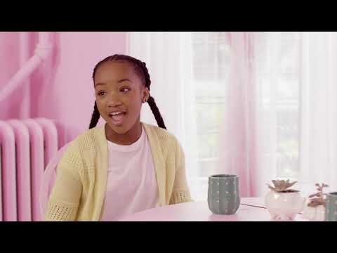
This was done to make sure the aesthetic of the video was strongly styled for the branding. We had a tight budget so had to be smart about our choices. You can see how it turned out below in the official video.


