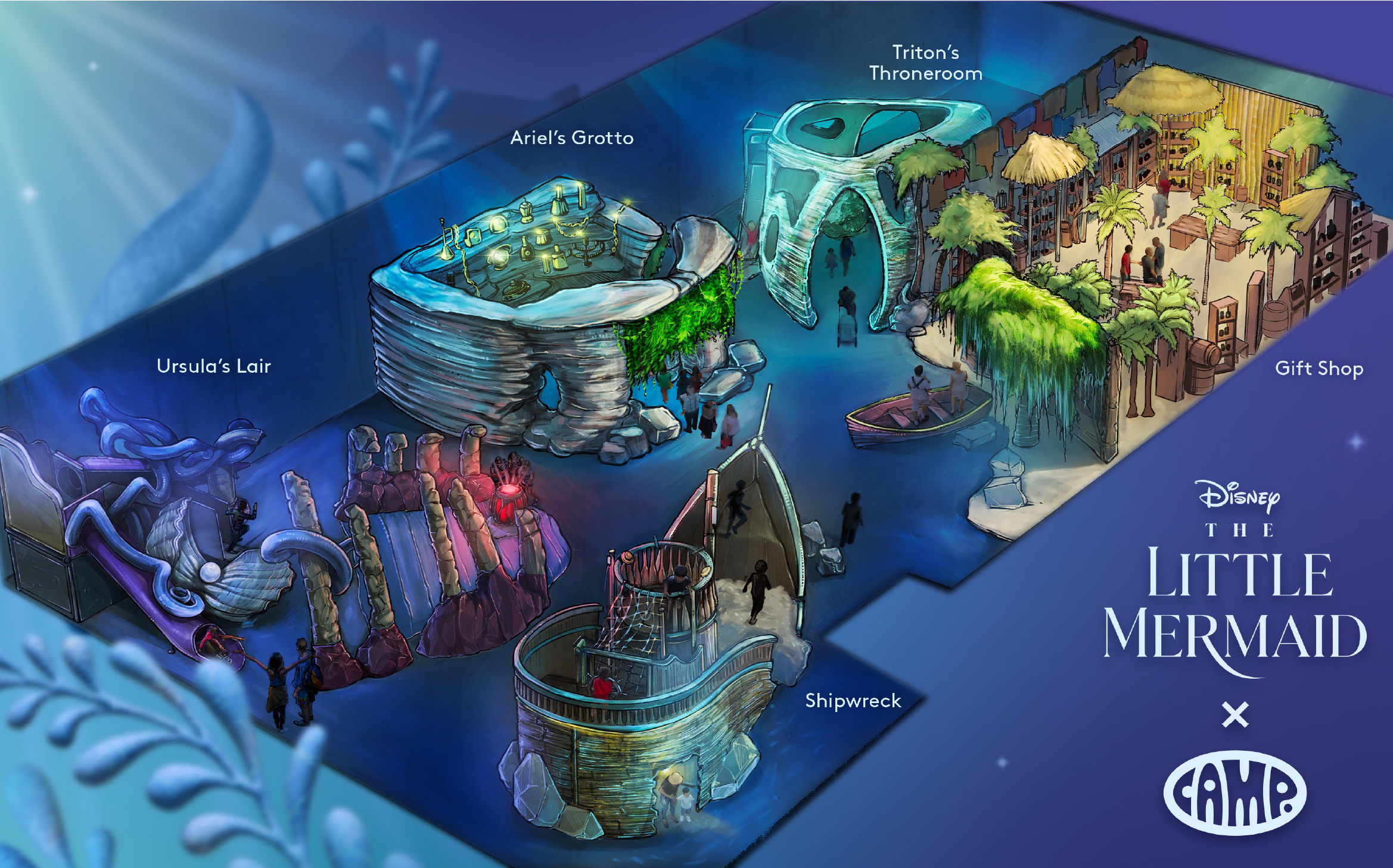
The Little Mermaid x CAMP Experience: Enter Through the Magic Door
Once you go through the Magic Door, you’ll discover an undersea adventure!
Go ahead and click through the gallery to feel the experience unfold.


Halle Bailey pictured here enjoying the experience
Part of a New World….
Little Mermaid was a new kind of experience for Camp because it was the first show we made based off of a live-action movie. This provided some fascinating challenges to tackle.
“How do you make something impactful enough to both represent A LITTLE MERMAID and not reference the cartoon at all?”
We Need A Hero
We needed to figure out how to create something atmospheric that really went with the live action movie as a standalone and not based on the animated picture.
I used shapes that our team had started messing around with and created a few heroes that exemplified the underwater wonder of the installation by playing with sea lighting, textures, photo manipulation, a hint of a tale, underwater gradients, a shark (!) — I was able to make it feel almost real, not too cartoony, and super atmospheric. The mood and atmosphere I created inspired the show’s promotional assets, including video.
Below you’ll see an image I created to contextualize the concept-art within the atmosphere I built as well as a hero poster I designed. These two images were the first step into finding a balance in the visual language that would accurately represent the show.
CONCEPT ART by Joshua Rivaldo

Final Branding and Visual Language
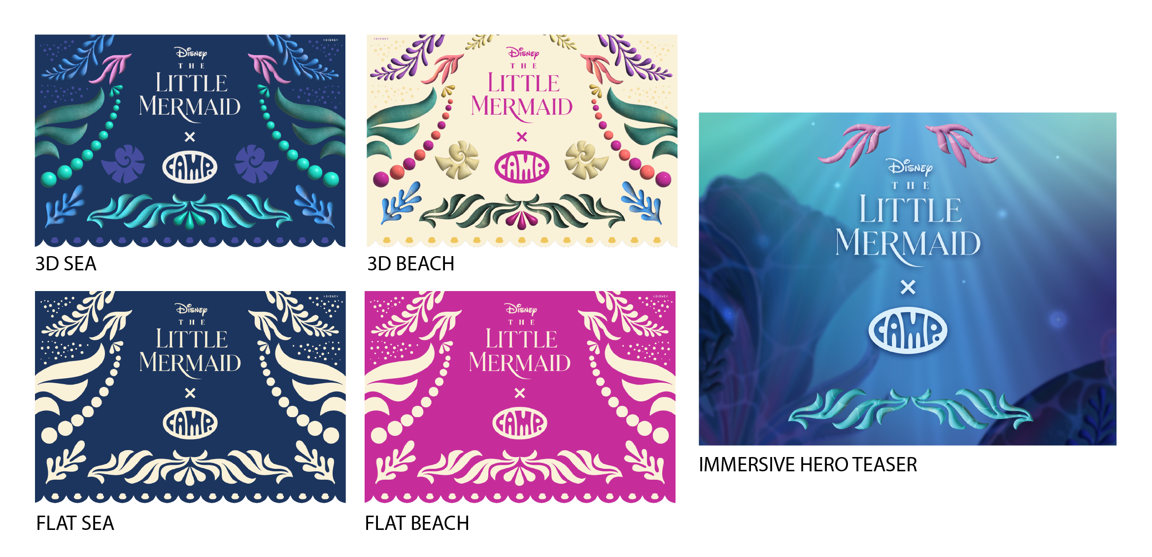
After the atmospheric developing, we needed shape language, patterns, and to solidify the pallet. I ended up developing a color story that was based off of the concept of the movie itself; half of the movie is under the sea, but the other half is on the bright shores of the beach. My colleague had created this beautiful frame out of our 3D shapes: white on a dark blue. He had begun to put together a moody, deep sea pallet, some of which you can see below— it’s beautiful. I wanted to build on that and expand it into something slightly different.
I really loved the idea of coral and seaweed being artfully arranged on the sand on both the beach and the sea-floor (pufferfish actually do this with sand), in different patterns, as though a someone had placed them there. So, to create them, I grabbed some shapes from the frame and added some more 3D shapes, some of them I made with a sandy texture. I made 10-12 different patterns and placed them on the ‘sand’ to build out diverse layouts of these shape patterns and kept some of them open patterns so we could use them as needed. Then, I created a separate pallet for the BEACH side of The Little Mermaid (where the people are) and edited the SEA pallet so that the two connected. The two worlds felt important to the story the movie was telling and the story we needed to reflect.
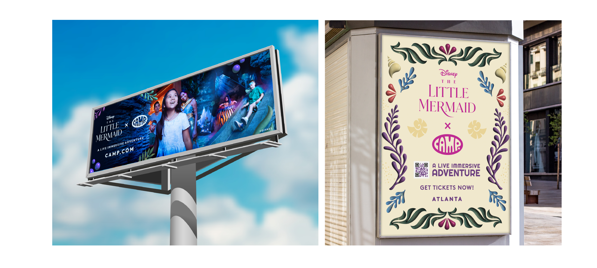
My work helped make the branding flexible for the dozens of different assets required to support a show of this size, and it also helped tell a story that felt more in line with a children’s show installation, which was a concern with the single pallet. There’s a fun spookiness to the world underwater, but we needed some levity and brightness, too, to relay that yes: this was for kids and parents! In addition to that, for certain use-cases, we needed a flat model for each color story (beach and sea). You’ll see a small sample of assets of each below. For digital, this was flexible and easy to apply in many different contexts.
How could we apply my designs to photography to make it feel immersive?
The answer I came to was to take the 3D elements and weave it into the photography to create an effect that was a little bit cartoony to offset any moodiness without detracting from the atmosphere. I also liked used the 3D elements to frame focal points, create movement, and and connect different layers of information. You’ll see below some examples of this in action.

Photography by Hope Glassel